מעצבת UX המעצבת אפליקציה לארגון חומרי למידה והוראה של מורים.
אחריות:
קיום ראיונות, שרטוט מסכים בנייר ובאופן דיגיטלי, אב טיפוס בחדות נמוכה וגבוהה, ביצוע מחקרי שמישות, תשומת לב לנגישות וביצוע חזרות ותיקונים.
- The designer’s role in the project
- Project goal
- Target audience
- Key challenges or constraints
- Research study details
- Initial design concepts
- Sketches or wireframes
- User testing results
- Mockups or high-fidelity prototypes of final, polished designs
- Conclusion noting what was learned through the design process and possible next steps
הפרויקט במבט על
המוצר:
יישום המאפשר למורה לארגן את חומרי ההוראה – קישורים, מסמכים וטיפים – במיקום יחסי לציר השנה.
משך הפרויקט:
שנתיים
הבעיה:
להוראה אפקטיבית ומיטבית דרושים חומרי הוראה רבים, מגוונים ומותאמים לקבוצת הלומדים ולמורה. אין 'קלסר' מקוון המאפשר לאחסן את כל אלו ביעילות ובצורה מאורגנת שתאפשר שליפה מהירה בהמשך, או שיתוף.
המטרה:
סדרת פעולות מהירה, יעילה וכייפית לארגון פריטים שקשורים להוראה, תוך הצמדתם לציר תוכנית הלימודים והוספת מידע מטא – איך נעשה שימוש בכל פריט.
הבנת המשתמש
מחקר משתמשים : תמצית
בעזרת ראיונות, מפגשים וסקרים חידדתי את הצורך המדויק של המורים. קבוצת רכזי תקשוב בחנה את אב הטיפוס הראשוני, הוסיפה הצעות וחידדה.
קבוצת המשתמשים הראשונה ביססה את את הנחת היסוד לפיה יש צורך בפלטפורמה ייעודית לשיתוף חומרי הערכה, דירוג וארגון שלהם. מורים רבים ציינו שיעדיפו להשתמש במערכת ששומרת את הקרדיט מאשר העברה ברשתות חברתיות קיימות, שיוצרות הצפה ובלגן.
מחקר משתמשים: כאבים
שיתוף
מורים נעזרים בהמון פריטי תוכן, ואין די זמן ליצור את כולם מאפס. לכן עבודת המורה בנויה על שיתוף - קבלה ותרומה.
ראייה כללית
איתור רכיבים לשיעור דורש תכנון פרטני וגם ראייה רחבה, של ההקשר ביחידה, ולאורך השנה כולה. מצד שני, הרכיבים צריכים להיות גמישים וניתנים להתאמה.
זמן
מורים צריכים לארגן הרבה פריטי למידה, בקצב מהיר מאוד, של עשרות שיעורים בשבוע. תהליך הארגון חייב להיות מהיר ויעיל.
ארגון
חומרי הוראה בדרך כלל נמצאים בבלגן, ובלי לקבל הקשר לתוכנית הלימודים או לרמה להם הם מתאימים.
פרסונה
הצהרת הבעיה
אלונה מורה ותיקה ומתחדשת. היא בונה חומרים ושמחה לתרום אותם למורים אחרים, אך נפגעת כאשר נגרם נזק לחומרים עצמם.
הצהרת הבעיה
מעיין מורה צעירה ואנרגטית, היא לומדת כל הזמן איך להעשיר ולשפר את ההוראה שלה. היא מחוברת לקהילות מורים שונות, ומוצפת בחומרים.
מפת מסע הלקוח
המורה מארגן פריטים על ציר זמן, מוסיף עליהם מידע מטא ומשתף.
בחירת קובץ, תיעוד דרך השימוש והצמדה למיקום על ציר שנתי
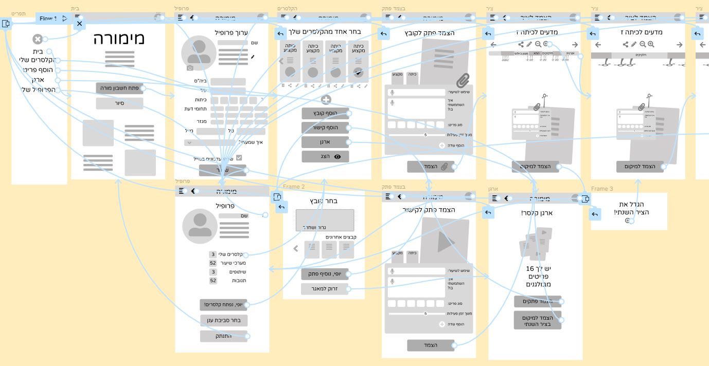
עיצוב התחלתי
עיצוב מסכים בנייר
הקדשנו תשומת לב מיוחדת למסלול המדויק והיעיל שהמורה עובר, על מנת להפוך את תהליך ארגון חומרי ההוראה לכייפי, נוח ומהיר.
לאורך הדרך, השיתוף זמין ומעודדים להעביר הלאה את הידע.
עיצוב מסכים דיגיטלי
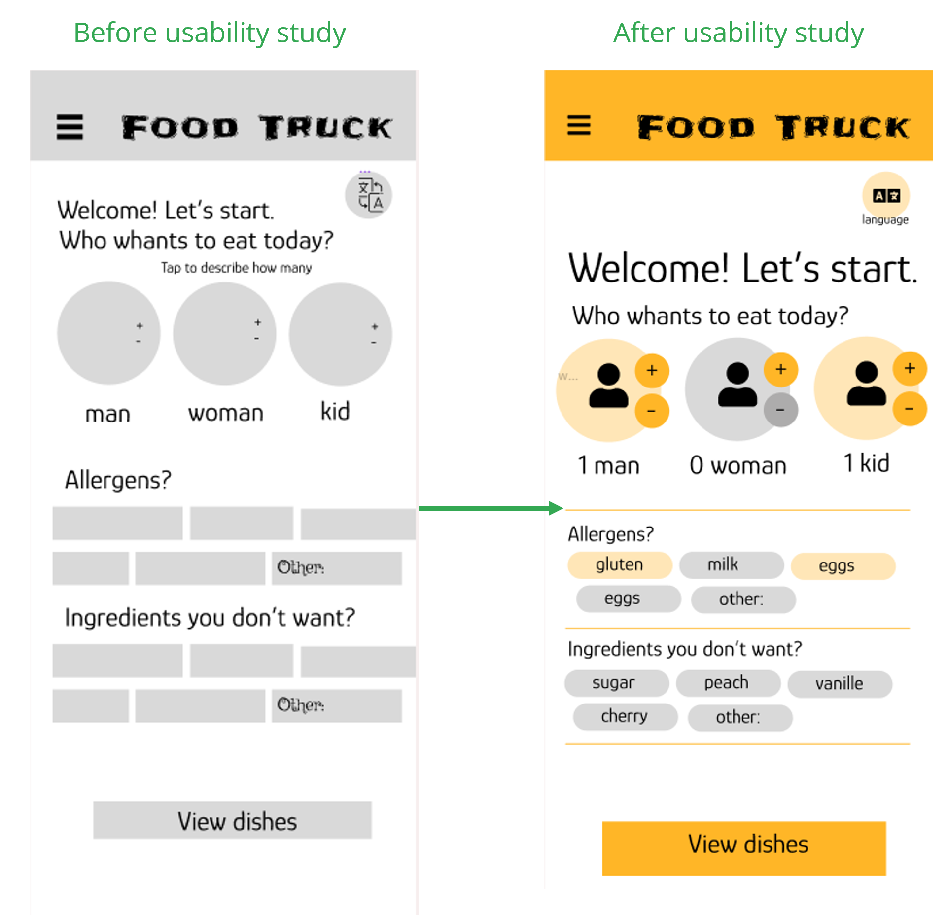
Onboarding process- before the user even sees the dishes or categories. One’s allergy is not an issue, just jot down the restrictions. Everybody has got some!
I conducted two rounds of usability studies. Findings from the first study helped guide the designs from wireframes to mockups. The second study used a high-fidelity prototype and revealed what aspects of the mockups needed refining.
Round 1 findings
Some buttons were not bold enough
The fun and personal approach was noticed.
Writing the ingredients is not easy.
Round 2 findings
Users expected visual cues
Users missed the sum info in the order page.
Adding separate allergens list for each customer
שיפור העיצוב
מוקאפ
In order to make the opening frame pleasing, the “Who is eating” buttons gives visual cues, the allergens are chips and less typing is needed. The button to next stop is bold and colorful.
Navigation menu align the standard for screen readers.
Provided a translation button for users from other areas.
Going forward
Takeaways
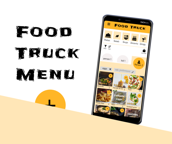
Impact:
The users are happy to claim their restrictions, and don’t need to hide their preferences or medical state. Everybody enjoys choosing the ingredients to exclude.
What I learned:
While designing the Food Truck menu, I was curious to see how the raw idea grows. The fact that this is the first UX process I’ve ever passed was another reason to be surprised at new steps that appear along the way. I’m very proud to show a menu that is not ordinary!
Next steps
Add some real data and recepies and see Feasibility of the app.
Conduct another round of usability studies to validate whether the pain points users experienced have been effectively addressed.
See wether any resturant would like to invest and make that app real.
צרו קשר
Thank you for your time reviewing my work on the Food Truck Menu app! If you’d like to see more or get in touch, my contact information is provided below.